About the Project
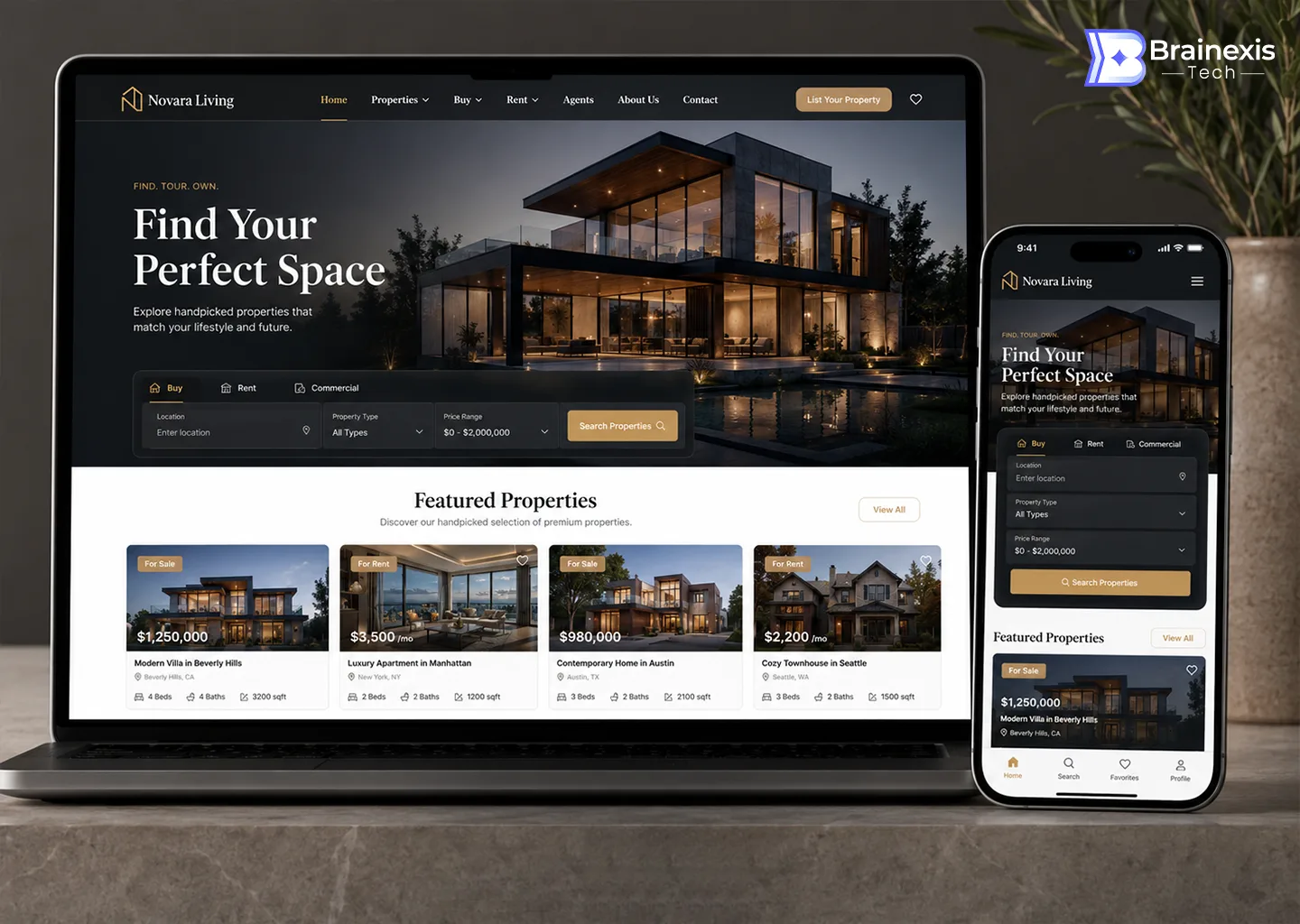
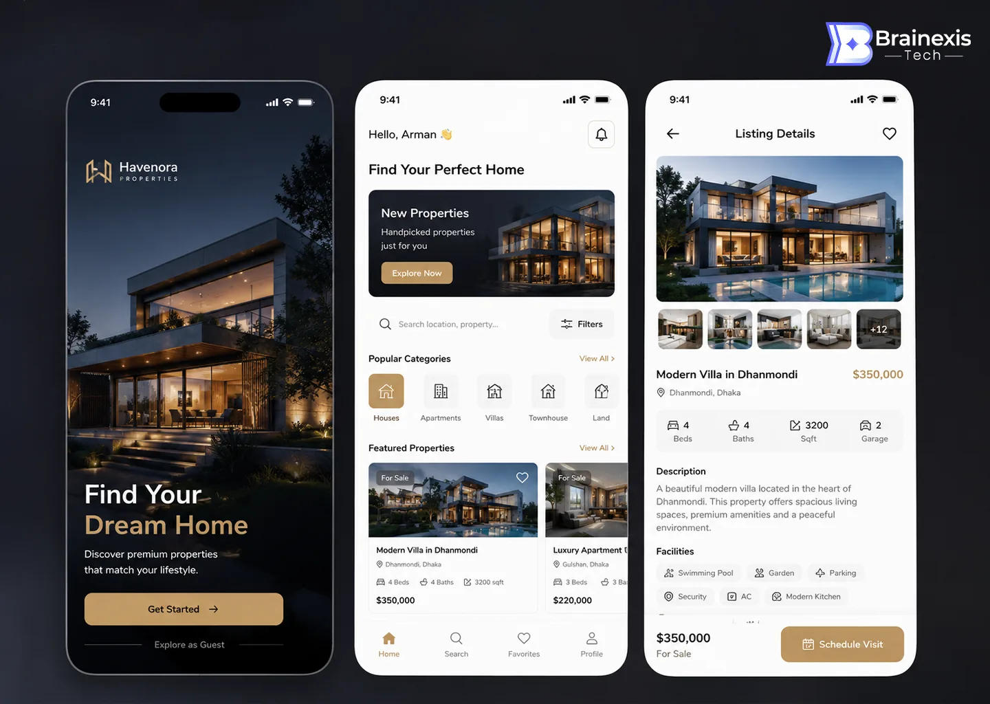
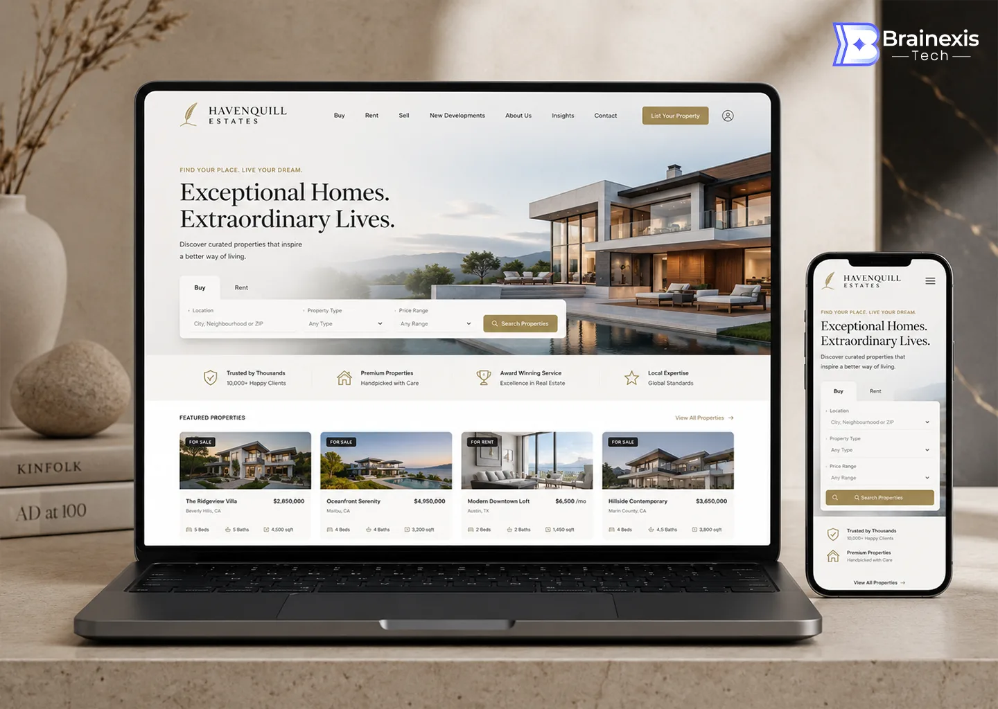
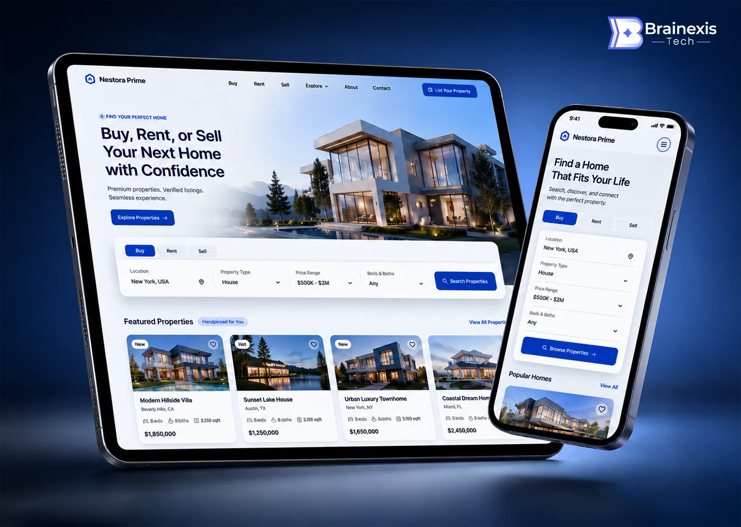
Havenora helps buyers discover premium properties that match their lifestyle and budget. We designed the full platform — a mobile app for browsing, saving, and scheduling visits, plus a responsive web experience — and pressure-tested the brand through three complete art directions: moody black-and-gold luxury, airy editorial cream, and a clean, trustworthy marketplace blue.
The Challenge
Real-estate platforms have to be aspirational and analytical at once. Stunning photography sells the dream, but buyers still need prices, beds, baths, and square footage at a glance — and the confidence to filter thousands of listings down to the handful worth a visit.
The Solution
We built the experience around full-bleed property photography with a disciplined data layer: listing cards that pair imagery with price and key specs, a persistent search-and-filter bar, and detail pages with galleries, facilities, and a ‘Schedule a Visit’ call-to-action. All three art directions share one underlying design system, so Havenora could choose a brand voice without rebuilding a single flow.
The Result
Listing views tripled as search and filtering moved front-and-center, and qualified visit requests rose 58%. The multi-direction exploration paid for itself: Havenora launched with the luxury direction and reused the marketplace-blue system for its rental sub-brand.
“We expected one design and got a complete visual strategy. Every direction was thought through to the last pixel — choosing was the hardest part.”